SteelCentral AppResponse by Riverbed, previously known as OPNet AppResponse Xpert, is a seriously awesome product. It’s a physical appliance, that’s dedicated to packet capture, typically from SPAN, RSPAN, ERSPAN sources, and can also be used as a serious Netflow/sFlow/jFlow collector. It then beautifully analyzes and displays this capture data in myriad ways, some of which are shown below. It is a supreme network troubleshooting tool. It’s like Wireshark on steroids – making network troubleshooting simpler, faster, easy to use, accompanied by many forms of graphical representation of network data and important metrics.
One can read the typical marketing and product page blurbs without completely getting an appreciation for the power of this product. To make matters worse, it’s nearly impossible to see any of it’s components in action, with conspicuous absence of screenshots, even on it’s own product page, hence, the existence of this humble blog post.
The appliance is basically a high end server, with 10 gb capture ports (in addition to a management port) with multi-terabit diskspace to continuously capture large amounts of packets. Depending on the throughput, it can be used to capture data for the whole data center (in smaller deployments), just the WAN ports, just a few specific applications, or any other combination of parameters that SPAN port on the network platform can support. Depending on the throughput, data spanned, and model of appliance purchased, you may have from anywhere from a few hours to few days or longer amount of raw network data/packets cached in your appliance at any given time. Throughput and other metrics are condensed and kept for a longer (configurable) period of time.
The appliances Java GUI is one of its best and most important assets. It’s powerful enough to show you almost any network metric you want without making it overly complicated or intimidating to use. I’ve personally never been trained on it – and have mostly learned it as I needed to perform troubleshooting with rarely needing to recourse to it’s help/documentation.
Now on to the good stuff!
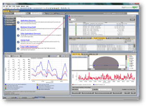
When you log into the appliance (after the requisite setup, capture ports configuration, licensing, and other relevant basic configuration), you are presented with the following main screen. Your session is saved as a file on your local desktop which defines the parameters of the specific appliances you are logged into and size/layout of the windows (with my specific layout example seen below).
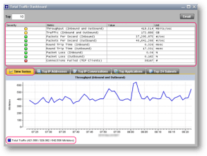
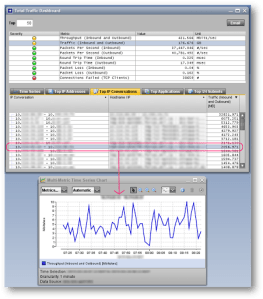
Clicking on “Total Traffic Dashboard” gives you the window shown below. This shows you a summary of all traffic being captured. In my case, we have the WAN ports SPANed and mirrored to the AppResponse appliance – so this shows the WAN throughput – along with other stats.
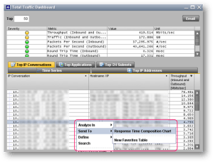
We can view various Top N parameters as shown below. This is great for quickly identifying top talkers.
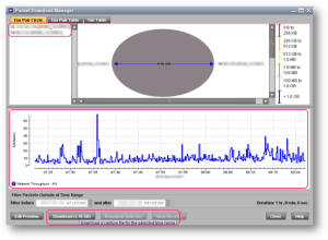
Here is where the fun begins. We can see actual packet level throughput details for any conversation simply by right clicking, and sending it to the Packet Download Manager.
Here, we can see the total amount of packets that were transferred in the specified session, and see a more granular throughput graph. This graph is a more accurate representation of the throughput for this particular conversation because it accounts for literally every packet. Further to that, you can download the packet capture, as highlighted. If you are using Wireshark to view the packet capture, you’d likely want to download smaller subsection – at least in this example anyways as it was a 4.18 GB file!
But wait, there’s more!
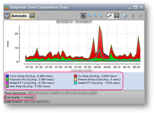
Instead of analyzing the packets in Wireshark manually, we can use built in tools in AppResponse to analyze the same data, by going to Response Time Composition Chart, as shown below.
AppResponse is capable of showing statistics for dozens of different metrics. In this particular chart, metrics related to Response Time are pre-packaged for us, and displayed.
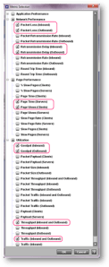
In case one is interested in displaying custom metrics, one can use the Multi-Metric Charts
Simply drag and drop the interesting flow/conversation into the Multi-Metric chart…
… and then check the metrics you are interested in displaying. If we suspect network saturation or packet loss, we may want to select below sample chosen metrics.
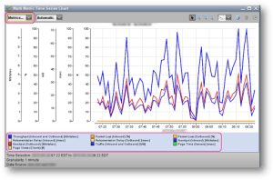
A deep interpretation of this chart may be able to tell us where this flow is experiencing delays; on the network, on the server end, on the user end, etc.
Smaller time slices can be zoomed into by clicking on the Horizontal Zoom icon (highlighted) and then selecting the interested area by dragging left to right.
Zoomed in results for the same set of metrics are show – for a shorter chosen time period.
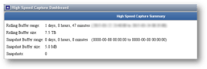
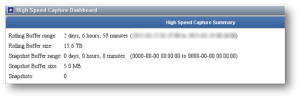
Different appliances have different size disks – which affect how much raw data is kept before the old data is cycled with new data.
This is an example of a 4100 series AppResponse appliance.
This is an example of a 5100 series AppResponse appliance.
I hope you found this article useful.
Corrections, questions, and general comments are most welcome! 🙂


Leave a comment